Folium - Map Visualization
When working with data that has a geospatial reference, there is usually the requirement to display it on a map.
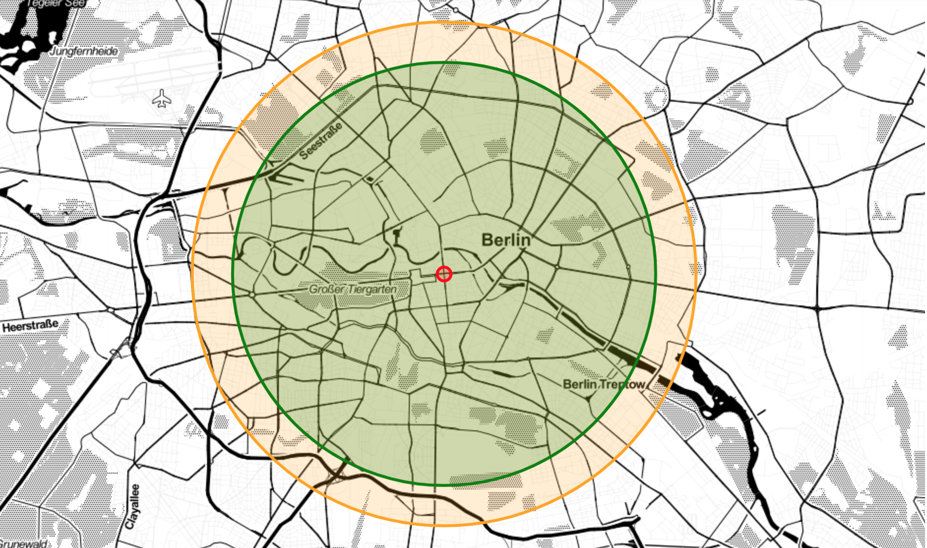
Folium makes it easy to visualize data manipulated in Python on an interactive map. By using leaflet, the map display works efficiently across all major desktop and mobile platforms. Folium allows passing rich vector/raster/HTML visualizations as markers on the map providing a higly customizable map visualization.
Exemplary map visualization of Corona data
Corona datasets contain geospatial references mapping infections, recoveries and deaths to the region they occur. The following code example creates a map visualization.
import folium

map_de = folium.Map(
    location=[location.latitude,location.longitude],
    tiles='Stamen Toner',
    zoom_start=5.5
)

mc4 = MarkerCluster(name="Corona marker landkreis", disableClusteringAtZoom=5)
mc5 = MarkerCluster(name="Corona marker landkreis", disableClusteringAtZoom=5)
mc6 = MarkerCluster(name="Corona marker landkreis", disableClusteringAtZoom=5)

for index, row in df_landkreis.dropna().iterrows():
    popup_text = "{}<br><br> infected: {}<br> recovered: {}<br> dead: {}".format(
                      row["Landkreis"],
                      row["AnzahlFall"],
                      row["AnzahlGenesen"],
                      row["AnzahlTodesfall"]
                      )
    #circle radius in meter, circle has 2*r like in 2m distance per person/fall
    folium.Circle(location=[row["latitude"],row["longitude"]],
                        radius= row["AnzahlFall"] * 10,
                        color="red",
                        popup=popup_text,
                        fill=True).add_to(mc4)
    folium.Circle(location=[row["latitude"],row["longitude"]],
                        radius= row["AnzahlGenesen"] * 10,
                        color="green",
                        popup=popup_text,
                        fill=True).add_to(mc5)
    folium.Circle(location=[row["latitude"],row["longitude"]],
                        radius= row["AnzahlTodesfall"] * 10,
                        color="black",
                        popup=popup_text,
                        fill=True).add_to(mc6)

mc4.add_to(map_de)
mc5.add_to(map_de)
mc6.add_to(map_de)
map_de
Three marker clusters with circular markers are created for cases of infection, recovery and death. The clusters are added as layers to the map. An HTML based popup is added to each marker for data display. The size of the circle markers depends on the number of cases, which have been enlarged by a factor of 10 for better display. The Stamen map design promotes a focus on the data.